Logging In and Accessing the Dashboard
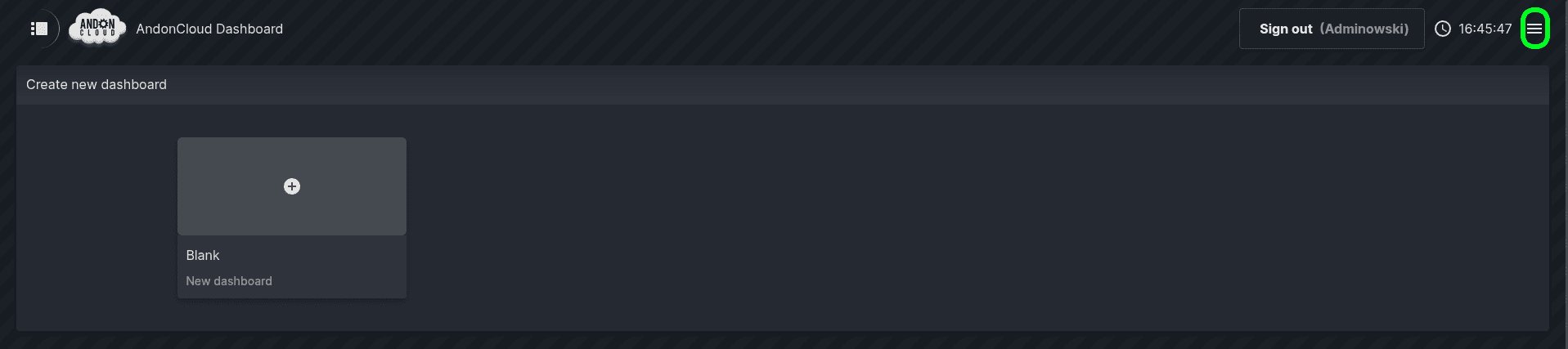
To start working with the Dashboard, log in to the system using your user account. After a successful login, the system will display the Dashboard home page, where previously created dashboards will be visible. In the upper right corner of the screen there is a menu icon that allows you to change the interface language.
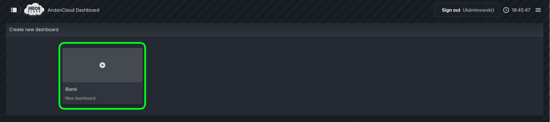
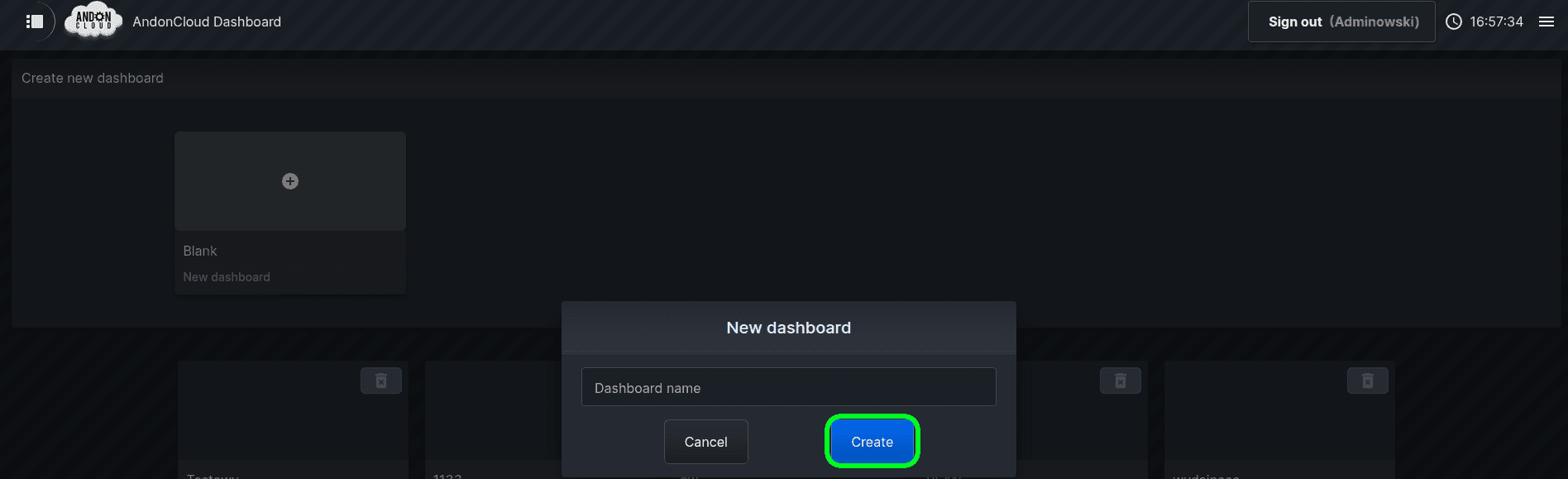
Next, please enter the name of the desktop and click ‘Create’.


We will now move on to configuring the dashboard. Please click on the newly created dashboard. The system will display a blank page, which we will populate with the relevant widgets. To do this, please click on the ‘Edit mode’ option.

The system will then display a list of available widgets. Please select the appropriate one and click ‘Create’.
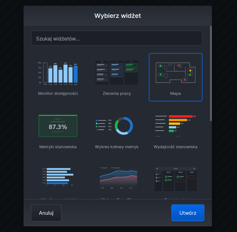
It is worth noting one important feature that applies to every widget: widgets can be arranged in any order on the desktop and resized. The icons highlighted below are used for this purpose.
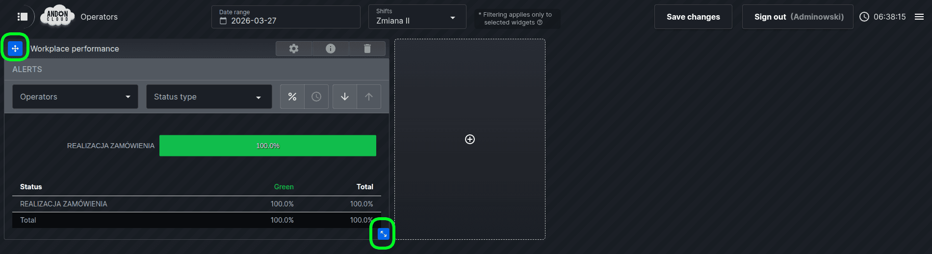
Available Widgets
1.Map
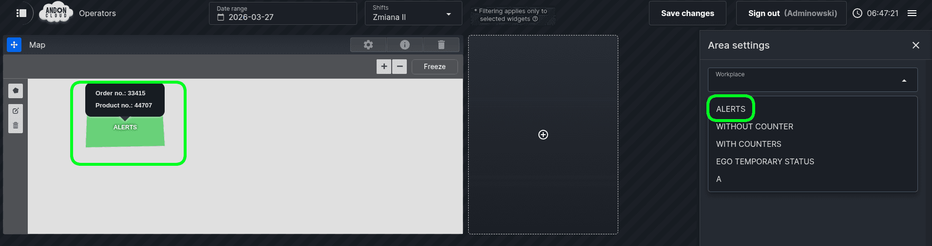
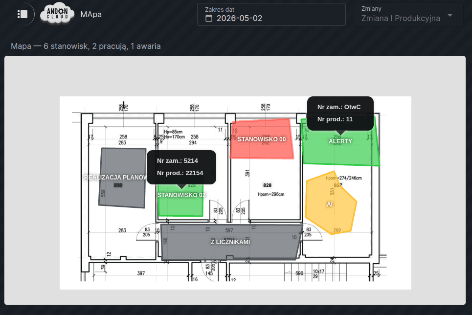
This widget is used to display the company layout showing workstation locations, as well as to show, in real time, the status of each workstation, the number of the order currently being processed, and the product number.
Creating a workstation layout without a room plan entered into the system
Please go to the dashboard and select the “Edit mode” option. Then click on the plus icon, select the “Map” widget, and confirm your selection by clicking “Create”.
The system will automatically display the “Settings” dialogue box regarding the selection of floor plans loaded into the database in the Admin Panel. Please click “Cancel”.
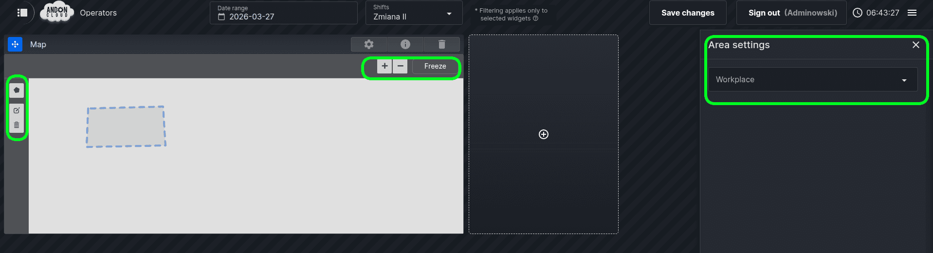
After clicking on a sketched area, the system will display (above the workspace) a menu with a list of workstations created in your organization in the admin panel. If no workstations have been created yet, the list will be empty. In that case, further work with the widgets will require creating and configuring a workstation. If needed, please refer to the workstation configuration guide.
If workstations are displayed on the list, you can continue with the configuration.
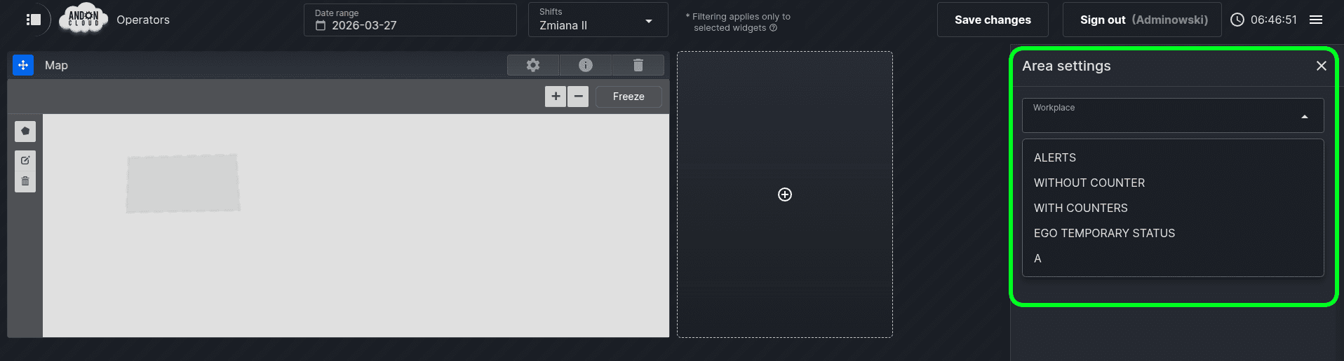
Select one of the workstations from the list. The system will automatically fill the area with the color of the status currently set for the selected work
- In the admin panel, go to "Dashboard" > "Room Plans".
- Click "Create Room Plan", enter a name, attach a file, and confirm.
- In the Dashboard, select the plan when creating the "Map" widget.
Note: The file must not exceed 10 MB and must be saved in JPG or PNG format. To reduce file size if needed, you can use free compression tools or a graphics editor (e.g., GIMP, Photoshop).
The room plan will be displayed on the dashboard and can be zoomed in or out as needed. Further configuration follows the same steps as creating a sketch without a room plan – with the difference that now you can precisely define the location of your workstations on the map of your facility.
2.Workplace Metrics
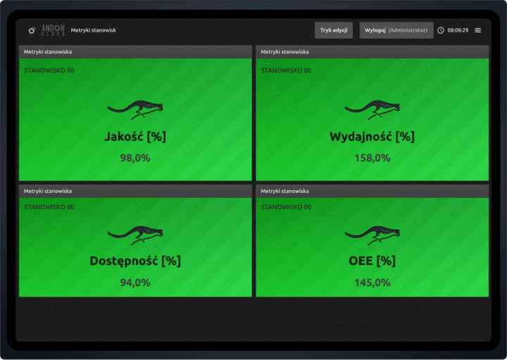
Allows real-time presentation of selected performance indicators for a single or multiple workplace.
From a long list of metrics, you can tailor the necessary performance indicators for one workplace or select a given indicator for multiple workplace. Each dashboard can be displayed on individual monitors/TVs placed on the production floor, etc.
3. Metrics Pie Chart
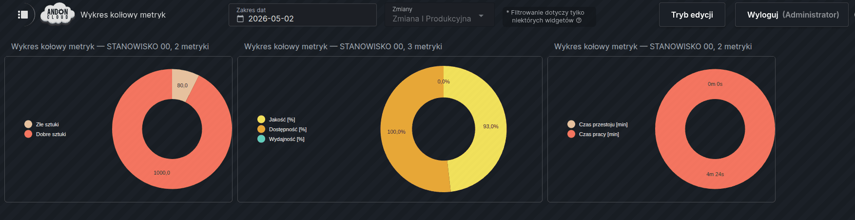
Enables visualization of workstation data in the form of a pie chart. In the form, indicate the appropriate metrics and workstation, then save the settings.
- On the relevant dashboard, click the "+" field and select the third widget from the list – "Metrics Pie Chart" – then click "Create".
- In the form, under the "Workstation" tab, select a workstation from the list.
- Under the "Metrics" tab, select the individual metrics in the desired order to be displayed on the chart.
- After selecting the metrics, confirm by clicking the "Save" button.
ℹ️ Note: The metrics list is long. After making your selection, collapse the metrics list – the "Save" button will then become visible.
4.PromQL Chart
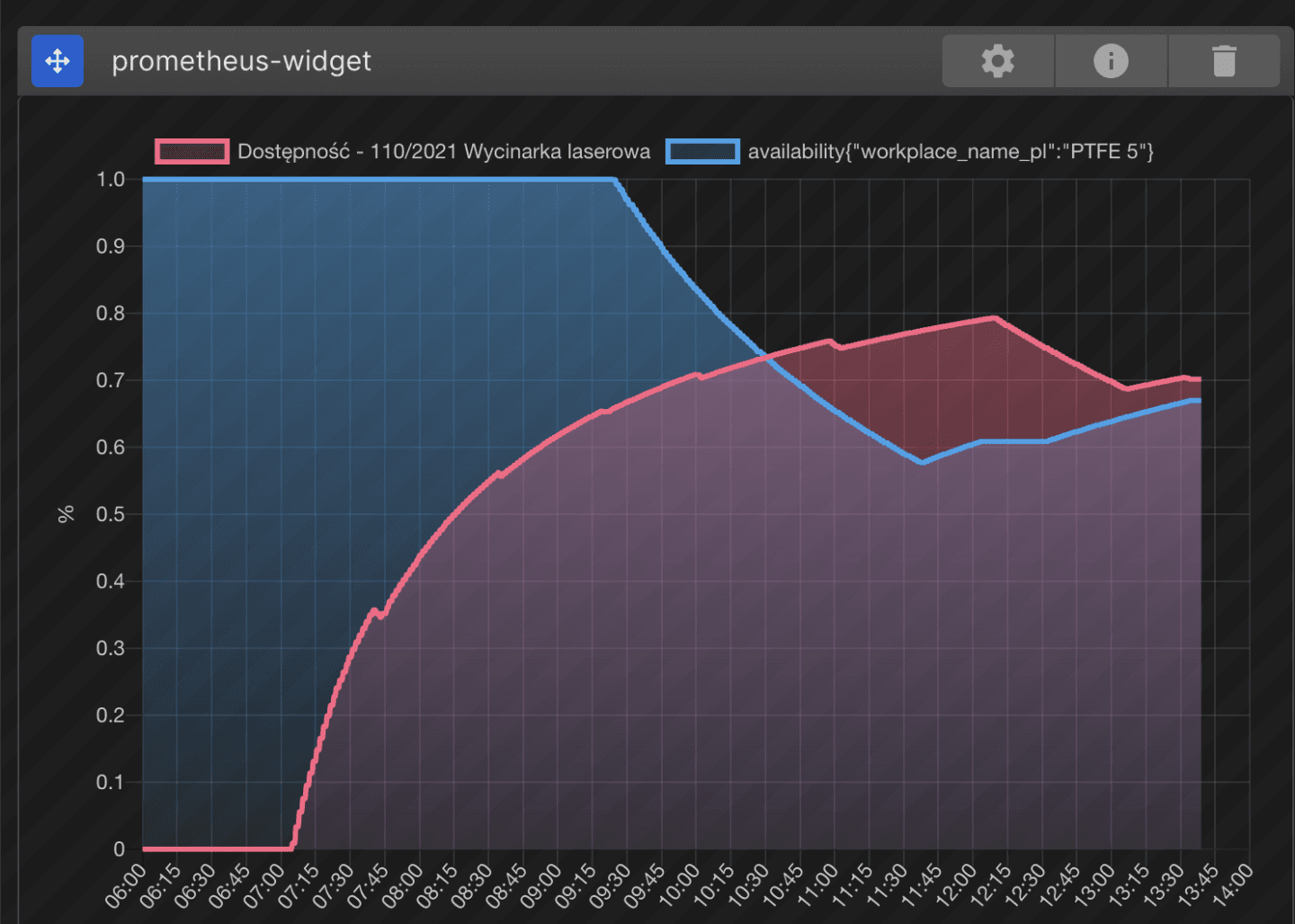
An advanced widget based on the PromQL query language, enabling dynamic analysis of time-series metrics (OEE, machine uptime, performance, errors, etc.).
Note: To configure this widget, you need a Prometheus server address. Configuration is handled individually by the technical team. If needed, please contact: support@andoncloud.com
Example use cases:
- Machine uptime: Displaying an uptime chart for machines, tracking how long devices were active in a given period.
- Failure rate: A chart showing the number of machine failures or errors over time.
- Production line efficiency: Analysis of the number of units produced over time.
- OEE: Charts showing key indicators such as availability, performance, and quality.
- Worker workload: Charts showing working hours in a given period (e.g., per hour, per day).
- Response time to issues: Monitoring employee response times to reported alarms.
- Human error analysis: Tracking the number of errors attributed to personnel.
- Shift performance comparison: Analysis of historical data to identify trends, e.g., a drop in performance on night shifts.
- Effectiveness assessment after changes: Monitoring indicators after process modifications or new technology implementations.
5.Metrics Table
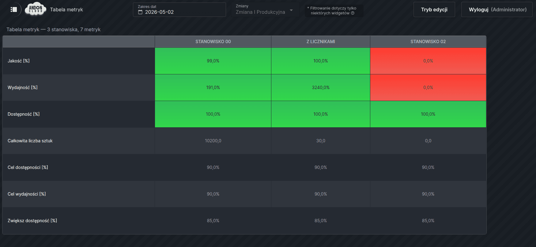
Presents metric data in a tabular layout. In the configuration form, indicate the workstation and the metrics to be displayed.
6. Status Change History (Current Shift)
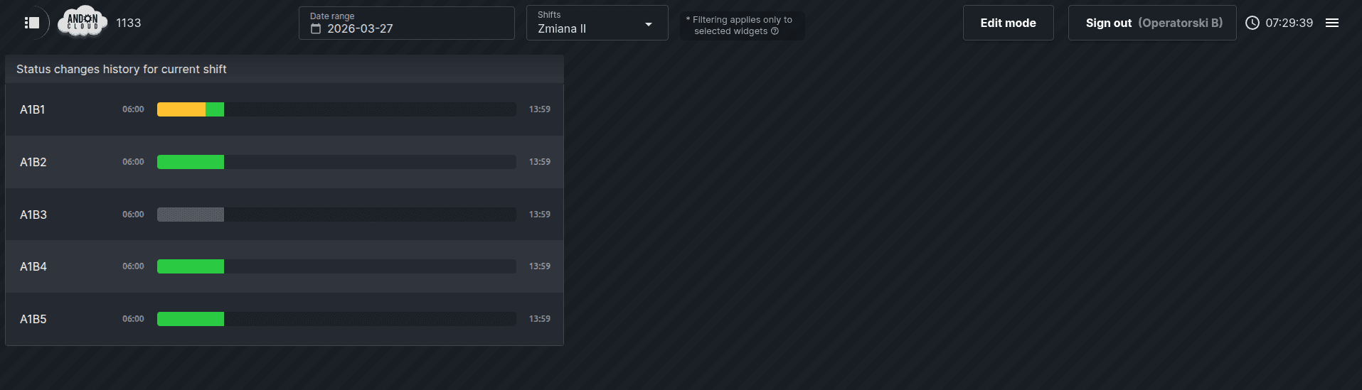
The "Status Change History for Current Shift" widget displays the real-time statuses of individual workstations during a production shift. Thanks to this widget, employees—for example, from the maintenance department—can view several or all workstations simultaneously, and an immediate status change—such as to "Failure"—allows them to take appropriate action without delay.
To add it, select or create the appropriate dashboard, then enable "Edit Mode." The next step is to click the plus icon and select the "Status Change History for Current Shift" option, then confirm your selection by clicking "Create." In the "Settings" dialog box that appears, under the "Workstation" tab, select from the list the workstations for which you want to display the status change history. Under the "Advanced" tab, you can enter a custom title for this widget.
7. Workplace Statuses
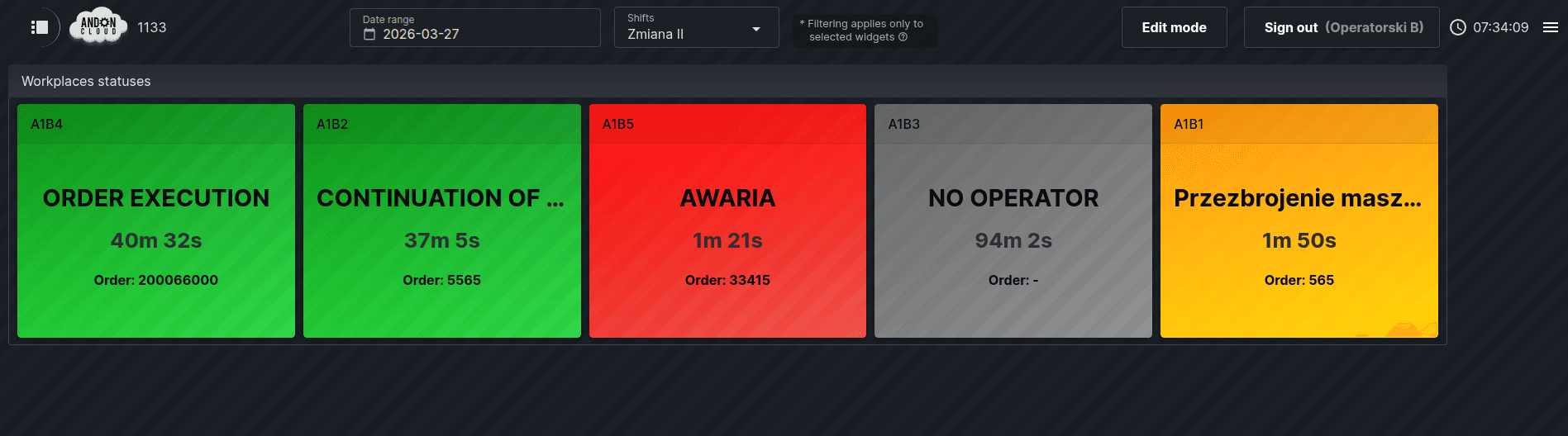
The "Workstation Statuses" widget provides a real-time overview of workstations with a specific status. Statuses are color-coded—green, orange, red, and gray—allowing you to immediately identify workstations requiring attention, such as those that are idle and marked with the "Failure" or "Service" status. In addition to the current status, the widget also displays the order number and product being processed at the workstation, as well as the duration of the current status.
To add it, go to the selected dashboard, enable "Edit Mode," then click the plus icon and select the "Workstation Statuses" option, and confirm your selection by clicking "Create." If you click the "Cancel" button at this stage without making a selection, the widget will display all workstations created in the system. To limit the view to only selected workstations, click the gear icon located on the top bar of the widget—this option is available in edit mode. In the "Settings" window, configuration takes place across three tabs: in the "Statuses" tab, select the statuses to be monitored; in the "Workstations" tab, select the workstations to be displayed; and the "Advanced" tab allows you to enter a custom widget title. After configuring all settings, confirm your selections by clicking the "Save" button.
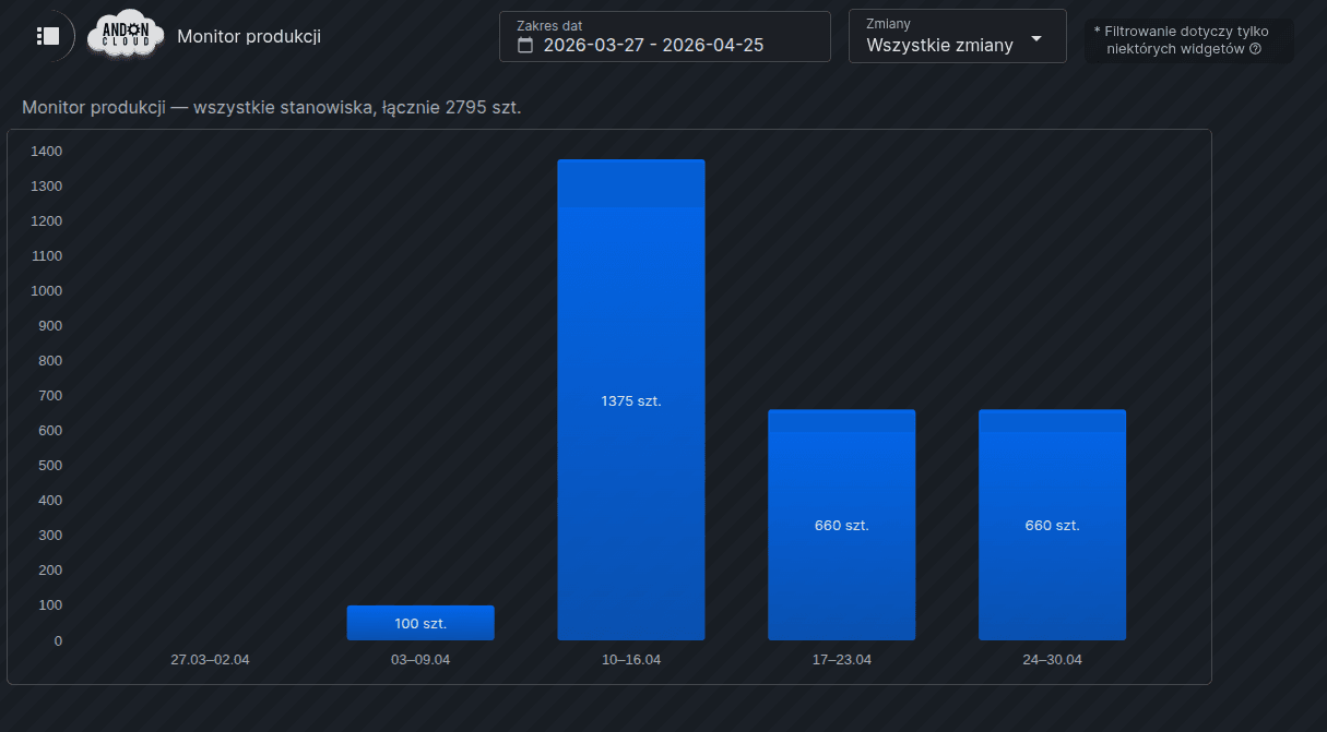
8. Production Monitor
This widget is used to display the number of good units produced in the form of a bar chart for all production stations. The range of data displayed depends on the dashboard filters: ‘Date Range’ and ‘Shifts’.
To add it, go to the selected dashboard, enable “Edit mode”, then click the plus icon and select the “Production Monitor” option, followed by “Create”. The system will automatically display the “Settings” dialogue box, with two tabs: “Settings” – allowing you to enter your own widget title, and “Advanced” – allowing you to select the data aggregation method (Auto/Daily/Weekly) and set the automatic refresh interval: 15 s, 30 s or 60 s. Once you have configured the settings, please click “Save”.
Reading the chart
Each bar on the chart represents a specific time period, and its length corresponds to the number of good units produced during that period. An exact numerical value is displayed next to each bar. The level of detail in the chart depends on the selected aggregation and date range:
1-day range – hourly view,
2 to 31-day range – daily view,
over 31-day range – monthly view.
Tip: If you are viewing data for the current day, the current hour is visually highlighted – in a lighter colour than the other entries – indicating that data for this interval is still being collected.
9. Availability Monitor
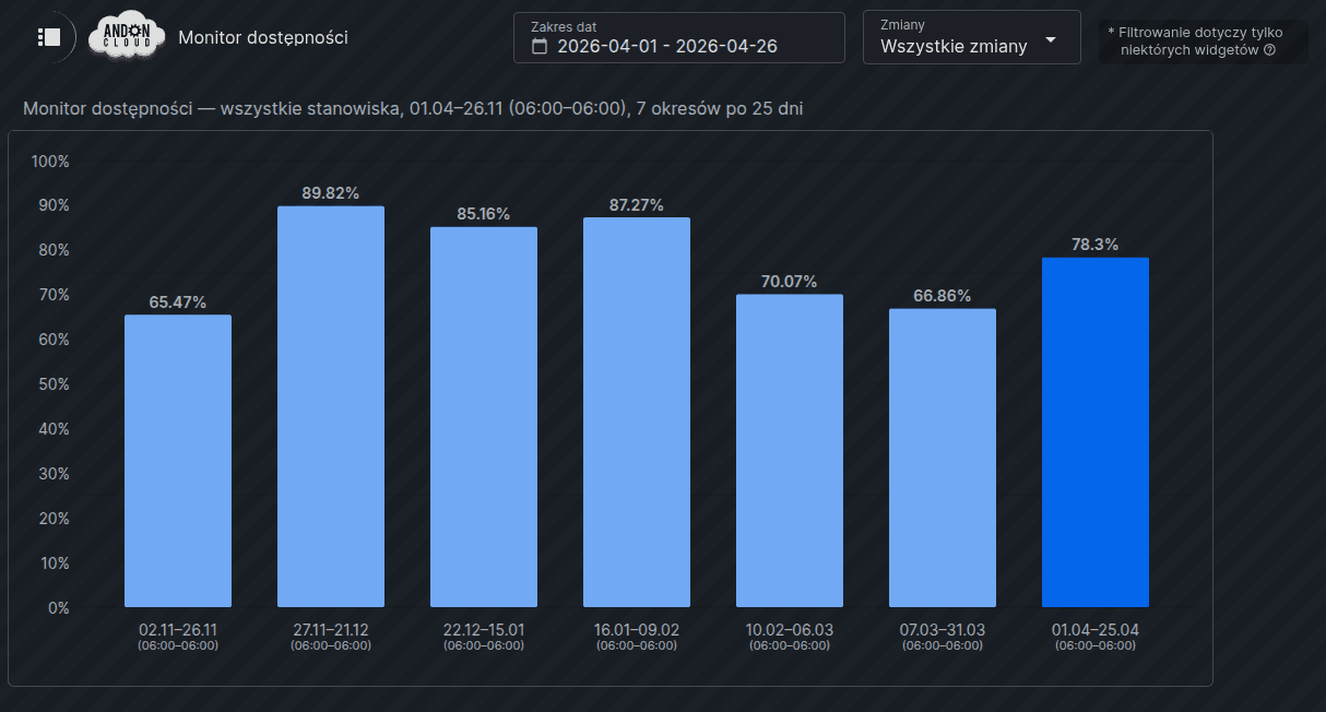
This widget is used to visually represent the availability of production workstations in the form of a vertical bar chart, allowing for comparisons across multiple periods. The range of data displayed depends on the dashboard filters: ‘Date Range’ and ‘Shifts’.
To add it, go to the selected dashboard, enable “Edit mode”, then click the plus icon and select the “Availability Monitor” option, followed by “Create”. The system will automatically display the “Settings” dialogue box, which contains two tabs:
Settings — allows you to set the number of periods to be compared (range: 2–13, default: 7) and the automatic refresh interval: 15 s, 30 s or 60 s.
Advanced — allows you to enter your own widget title.
Once you have configured the settings, please click “Save”.
Reading the chart
Each bar represents the availability of workstations (as a percentage) for a single period. The length of the period corresponds to the date range selected in the dashboard filters. The widget automatically repeats this period backwards as many times as the set number of periods being compared. The right-hand bar always represents the currently selected range; the subsequent bars represent previous periods of the same length.
Labels on the X-axis depend on the day type set in the filters:
calendar day: 26/Mar/Week 9/Jan 2026,
production day: labels additionally include the hourly range in brackets, e.g. 26/27 Mar (06:00–06:00).
Bar colours
The currently selected period (right-hand bar) is highlighted in colour. Historical periods are shown in a lighter colour. A bar with a dashed outline indicates a lack of data for the given period. This should not be confused with a 0% availability value, which is displayed as a normal filled bar.
Tip: If data is available for fewer periods than the set number of periods to be compared, the chart will display as many bars as there is data available. If the data covers fewer than 2 periods, the system will display the message: “Insufficient data, comparison requires at least 2 periods”.
10. Job Order Monitor
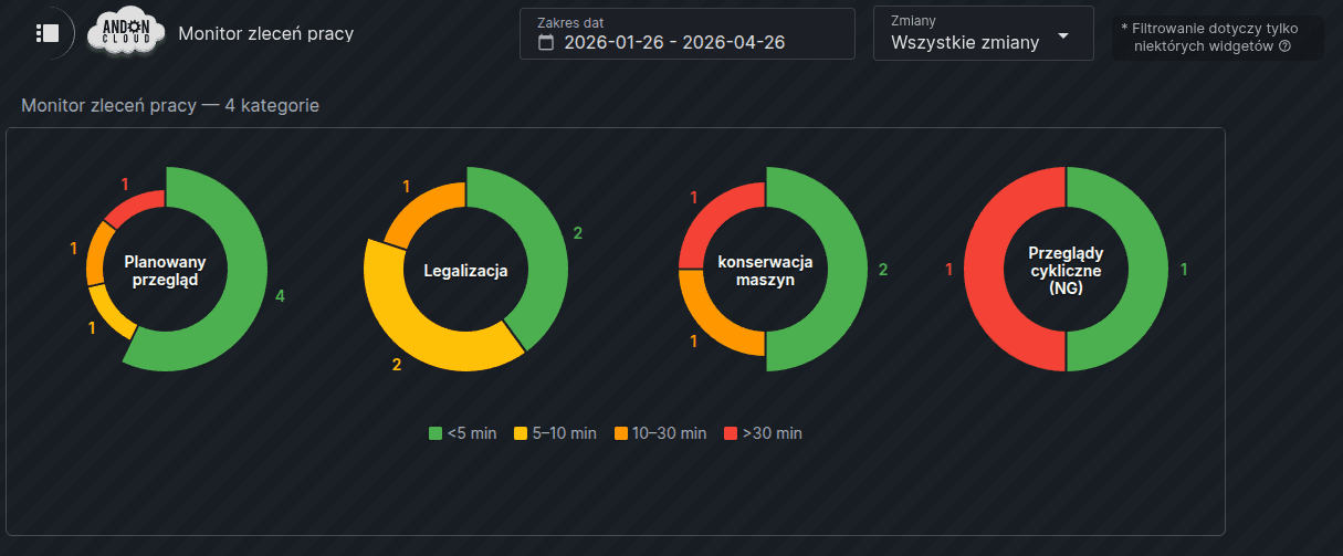
The "Job Order Monitor" widget displays the time distribution of completed orders in the form of pie charts, enabling a quick analysis of order completion times by category.
A separate chart is displayed for each order category, divided into four duration ranges: under 5 min, 5–10 min, 10–30 min, and over 30 min. The thickness of each segment’s arc is proportional to the number of orders, and the charts are sorted in descending order by the total number of completed orders. If a category has no completed orders in the selected period, an empty ring is displayed with the message “No data.”
To add the widget, go to the appropriate dashboard, enable “Edit Mode,” click the plus icon, select the “Job Order Monitor” option, and then confirm your selection by clicking “Create.”
By default, the widget displays all order categories. To limit the view to selected categories, click the gear icon on the widget in edit mode. In the "Settings" tab, select the categories of interest and confirm by clicking "Save." Deselecting all categories means no filtering—all categories will then be displayed.
The widget automatically refreshes the data. The default refresh interval is 60 seconds. You can change the refresh interval in the "Advanced" tab, where you can select 15, 30, or 60 seconds. The widget also responds to changes in dashboard filters, such as the date range or day type—the data refreshes immediately after a change is made. For predefined periods, such as "Today" or "Current Shift," the widget automatically detects the change in day or shifts and updates the charts with the new date range.
11. Status Analysis
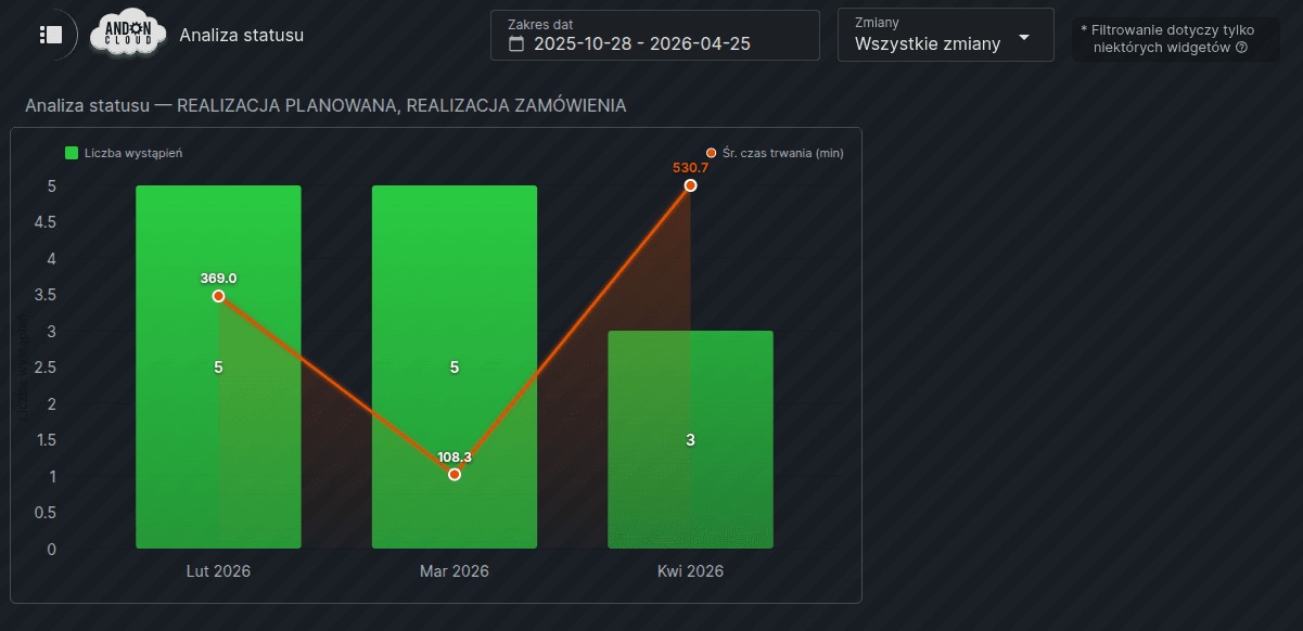
The "Status Analysis" widget allows for a detailed analysis of a selected status, displaying the number of occurrences and the average duration for specific time periods in the form of a bar chart with an overlaid trend line.
To add the widget, go to the appropriate dashboard, enable "Edit Mode," click the plus icon, select the "Status Analysis" option, and then confirm your selection by clicking "Create." In the "Settings" dialog box, configuration takes place in two tabs: in the "Settings" tab, select the workstation and the status to be analyzed, while the "Advanced" tab allows you to set data aggregation, the refresh interval, and enter a custom widget name. After configuring all settings, confirm your selections by clicking the "Save" button.
Reading the chart
The bar chart displays the number of occurrences of a given status in the color assigned to that status, while the line overlaid on the bars indicates the trend of the average duration in minutes. Each bar and line point is labeled with the exact value. When one period shows a significantly longer average duration than the others, the widget automatically adjusts the scale to ensure all points remain legible.
You can customise the chart view to suit your needs by hiding the trend line or the bar chart. To do this, click the relevant legend label on the widget: ‘Average duration in minutes’ to hide the trend line, or ‘Number of occurrences’ to hide the bar chart.
Data Aggregation
The widget automatically adjusts the chart's granularity to the date range set in the dashboard filters: for a single day, data is displayed on an hourly basis; for a range of 2–31 days, on a daily basis; and for ranges exceeding 31 days, on a monthly basis. Setting the aggregation to "Automatic" means that the widget selects the granularity itself depending on the selected date range, while selecting a specific aggregation, e.g., hourly, enforces a fixed granularity regardless of the range. The chart updates smoothly, without a visible reload.
The horizontal axis labels depend on the active granularity:
Hourly — a range of hours, e.g., 08:00–09:00.
Daily — for a calendar day, the date (e.g., 03/26); for a production day, a range of two dates with shift boundary times (e.g., 03/26–03/27 (06:00–06:00)).
Weekly — ISO week number (e.g., Week 10) or a date range if the week does not start on Monday.
Monthly — abbreviated month name and year (e.g., Mar 2026).
12. Work Orders
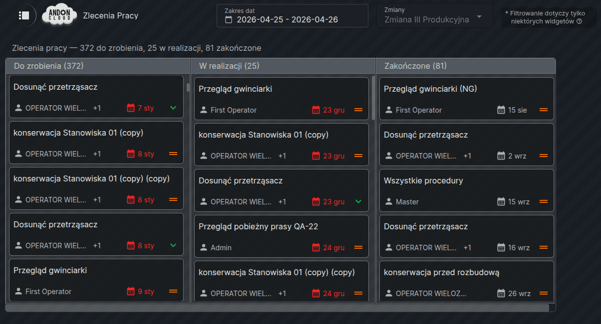
The "Work Orders" widget displays created work orders in a Kanban board format, allowing you to view and manage tasks in real time directly from the dashboard.
The board is divided into three columns: "To Do"—containing orders with the "To Do" status, "In Progress"—with orders currently being processed, and "Completed"—displaying completed and canceled orders. Paused orders are not visible on the board—they remain accessible only in the Administrator Panel under the CMMS tab. Orders are sorted by due date and priority and can be freely moved between columns using drag-and-drop. When you click on a selected order, the system displays its details, allowing you to add procedure steps, change the department column, and mark the order as completed after the work is done.
To add a widget, go to the appropriate dashboard, enable "Edit Mode," click the plus sign, and select the "Work Orders" option, then confirm your selection by clicking "Create."
The work order widget has no settings to configure. You can only enter a custom name for the widget in the "Advanced" tab.
13. Workstation Performance
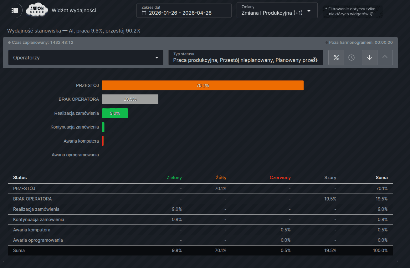
The "Workstation Performance" widget allows you to monitor and analyze the operating time of production workstations in real time, broken down by status and cause—from operating time and scheduled downtime to breakdowns and other events. Data can be expressed as a percentage or in minutes, and access to the history covers the last 30 days in the basic version—the premium version allows you to view data going back up to one year.
To add a widget, go to the appropriate dashboard, enable "Edit Mode," click the plus icon, select the "Workstation Performance" option, and then confirm your selection by clicking "Create." In the "Settings" window, select a production workstation from the drop-down list and confirm by clicking "Save." In the "Advanced" tab, you can enter your own name for the widget.
Dashboard Filters
At the top of the dashboard, you'll see two filters: "Date Range" and "Changes." The "Date Range" filter allows you to select the period for which data is to be displayed. Two time modes are available: calendar (00:00–23:59) and production, which covers the time from the start of the first shift to the end of the last shift. The system also offers predefined periods, such as Current Shift, Previous Shift, Today, or Last 7 Days. Periods exceeding 30 days require an extended subscription. When the widget is first launched, "Current Shift" in production mode is set by default. The "Shifts" filter is used to select a production shift. When selecting the "Current Shift" or "Previous Shift" option, the system automatically selects the appropriate shift; for other periods, you can manually select one or all shifts.Dashboard Filters
Widget Filters
At the top of the widget is a toolbar with filters, which remains visible while scrolling through the content. The "Operators" filter allows you to narrow down the data to a specific operator or group of operators, while the "Status Type" filter lets you display data only for a specific status type, such as "In Service," "Scheduled Downtime," or "Failure." The "% / Time" button lets you switch the view between percentage values and actual duration in minutes, and the sort button allows you to change the sorting order of the data. The chart and table update automatically after each filter change.
Note!
If there is no operator data for the selected workstation and period, the message "No operators" will appear in the menu.
Reading the Chart
The bar chart shows the distribution of a workstation’s operating time by status. The width of each bar corresponds to the percentage of time spent in a given status, and its color corresponds to the color assigned to the status cause in the system (green, yellow, red, gray). Each bar is labeled with the exact percentage or duration, depending on the active display mode.
The system distinguishes the following status types: “Running” – the machine or line is operating and fulfilling production orders according to plan; “Unplanned Downtime” – production has stopped due to unplanned causes, such as a breakdown, material shortage, or quality issue; “Scheduled Downtime” – a planned production stoppage, e.g., maintenance, changeover, inspection, or line cleaning; “Off Schedule” – the plant is not producing on a given day, e.g., on a weekend, holiday, or day off.
Time marked with the "Out of Schedule" status is completely excluded from the calculation of KPIs—availability, MTBF, and MTTR—and is displayed as supplementary information, not as part of the chart. As a result, the percentages in the chart add up to 100% and apply exclusively to scheduled production time, while the metrics reflect actual efficiency in working days.
Below the chart is a table with a detailed breakdown of times and percentages for each status, grouped by the colors of the causes and status types described above. It is worth noting that the color green does not refer exclusively to production—it may also include other operator activities, such as training, implementing a new procedure, or assessing product quality. The same principle applies to every color defined in the system.
14. Staffing Allocation
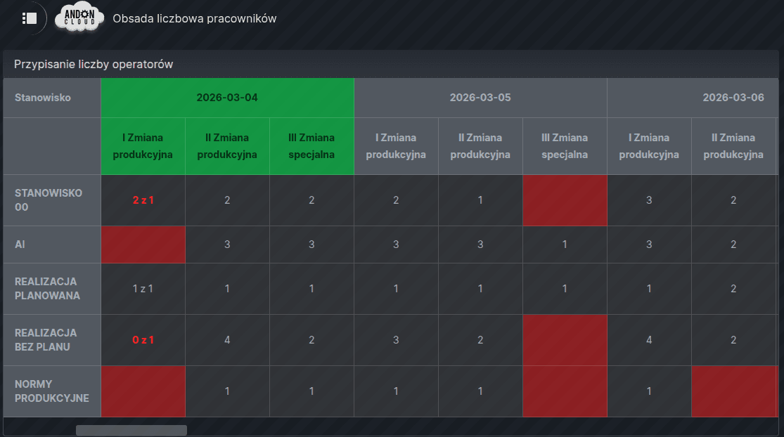
The "Staffing Allocation" widget is used to plan the number of employees needed for specific positions, broken down by day and shift. It serves as the basis for staffing management and allows you to monitor in real time whether the actual number of clocked-in employees matches the plan.
To add it, go to the appropriate dashboard, enable "Edit Mode," click the plus icon, select the "Operator Allocation" option, and then confirm your selection by clicking "Create." In the "Settings" window, under the "Filters" tab, select the department and positions for which the system should display schedules—if no positions are selected, the system will automatically display all available ones. The "Advanced" tab allows you to set the refresh interval and enable or disable the drag-and-drop feature, which automatically fills selected fields with a specified value, as well as enter your own widget title.
Reading the Widget
The widget displays a three-week schedule: the previous two days, the current day, and the next 18 days. The current day is marked in green, Saturday in orange, and Sunday in red. The numbers displayed in the fields correspond to the number of scheduled employees for a given workstation, day, and shift. The entry “0 of 2” in red means that 2 people were scheduled, but no employee has clocked in for that position. A single digit in red, on the other hand, means that an employee has clocked in for that position, even though no staff were scheduled there.
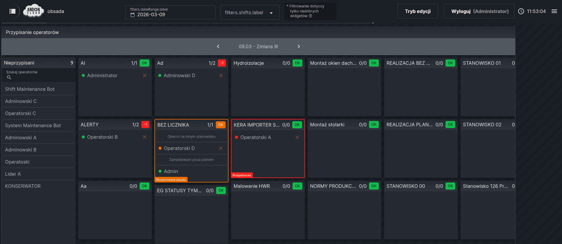
15. Operator Assignment
The "Operator Assignment" widget allows you to assign specific employees to positions based on a predefined staffing plan.
To add the widget, go to the appropriate dashboard, enable "Edit Mode," click the plus icon, select the "Operator Assignment" option, and then confirm your selection by clicking "Create." In the "Settings" dialog box, under the "Filters" tab, you can select a department and set the refresh interval.
The "Advanced" tab allows you to enter your own widget title.
Note!
If there are many workstations, it is recommended to group them into departments.
Assigning operators to a workstation
Staffing is managed by assigning employees using the "drag and drop" method from the pool of unassigned employees (visible on the left side of the screen) to the selected workstation. The system does not allow the same operator to be assigned to two different workstations within the same shift—attempting such an assignment will automatically transfer the operator from the previous workstation to the new one. All assignment changes take effect “from date X forward”—the system does not allow retroactive modifications to assignments. Once assigned to a position, an operator remains in that position every subsequent day during the same shift until they are transferred or removed from the position.
Reading the Widget
Each workstation tab displays the workstation name, the number of scheduled and checked-in employees, and a schedule compliance indicator: OK, +N, or -N. In the current shift view, a colored dot next to each operator indicates their check-in status: green means checked in at the assigned workstation, red means not checked in, and orange means checked in at a workstation other than the assigned one. Employees checked in outside the plan—that is, not formally assigned to any workstation—are displayed with a green dot and can be formally assigned to their check-in location using the button in the side panel, accessible by clicking on the operator’s tile.
Note: The Administrator Panel is intended solely for system administrators to make corrections. For day-to-day operational work, use the monitoring dashboard.